At Sygic we strive for data-driven decisions. Recently, we have been considering List vs Tiles while designing a new Search Options screen. Setting up a simple click test to see the actual performance of both design approaches was an obvious choice. Yet, some of the observations were rather suprising.
Theory
Our brain needs 0.1 second to process a visual scene. A well designed icon takes around 0.15 second to process and another 0.1 second to assign a meaning to it. The average speed of reading is somewhere near 200 words per minute.
Imagine how many words you would need to describe a visual scene in enough detail. How long it will take a person to understand the information from a text compared to an icon or a picture?
Hypothesis
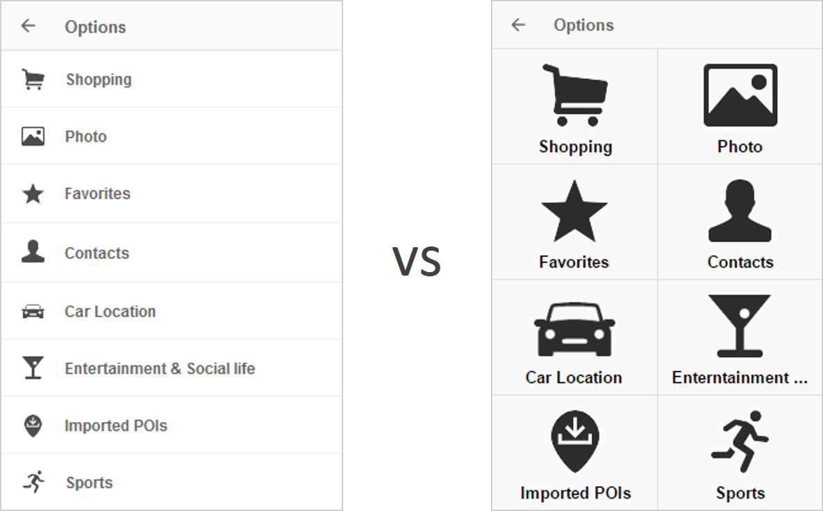
We might end up with 23 different items to show on the screen. They were all put together by our users in a card sorting experiment, but it’s still too much to choose from.
Putting the most commonly used items at the top of the list might help to address this issue. Using tiles large enough to fit a big and descriptive icon of the item could be easier to process and to tap on.
If we are right, icons in tiles should be faster to process and to choose from.
Click Test
We have asked 200 people to find a specific item on the screen. 100 people had to find the item in a List, another 100 people in Tiles.
The experiment contained 17 tasks which took them less than 4 minutes to complete. Success rates and times of all tasks were then compared between List and Tiles.
Moreover, eight people were observed live while doing the experiment. This helped us to better understand their scanning patterns and put them in perspective with hard data.
Observations
1. Amount of items and position matters
Clearly, top positioned items were fastest to find. Also, the more items were featured, the more time it took to scan through them. Stating the obvious, but still nice to see the data visualized and speak for themselves.
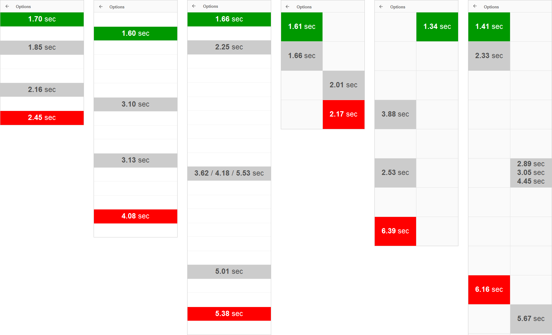
2. Whether it’s known or unknown item doesn’t really matter
Our expectation was that the items which are well known like Favorites, Home or Parking will take less time to find. Here we have included all items which we have asked people to find in some of the previous tasks so that they were already familiar with them. Items seen for the first time in a task were considered as unknown. To see how it affect the results, we’ve also played with the position of these items.
Processing times were compared in 6 different occasions. With no clear pattern to be found and very similar processing times, the difference between unknown and known items is insignificant. It looks like our brain still needs the same amount of time to scan through the items and that the known and expected ones aren’t just popping out that much.
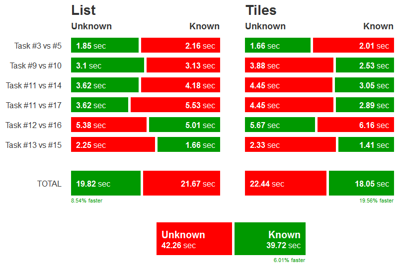
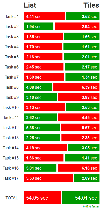
3. Whether it’s List or Tiles doesn’t matter at all
Finding the item in List was faster in 6 tasks. Finding the item in Tiles was faster in 9 tasks. However, total median times for both were almost identical with Tiles performing only 0.07% better. Again, statistically insignificant result with no clear winner.
4. They say icons but use text anyway
In all 17 tasks the screens were black & white. This was to make sure people only consider text and icons, nothing else.
Tiles experiment participants said it’s icon they consider first, then confirm with text. But the same pattern was also described by List experiment participants.
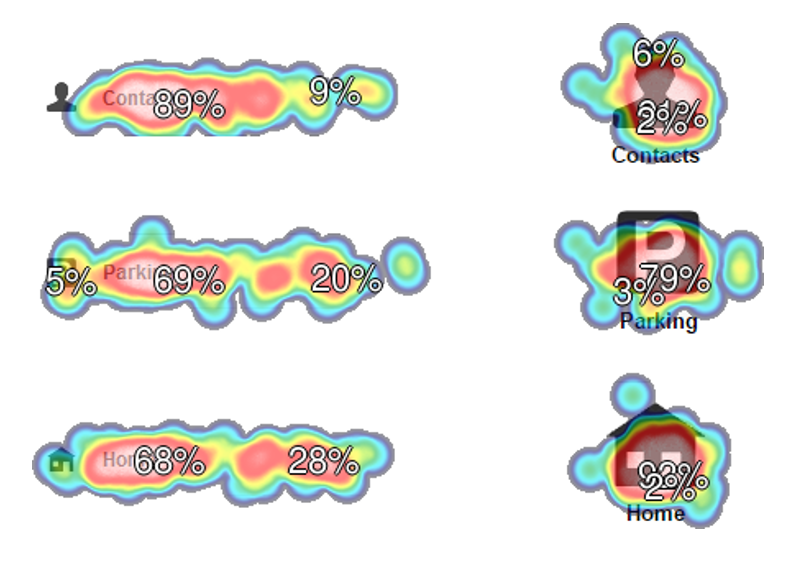
Heatmaps revealed that List participants were actually using text, not icons. This behavior was also confirmed during live observation sessions. Some of them have even suggested to sort the items in alphabetical order. None of the Tiles experiment participants mentioned alphabet in their feedback.
5. It’s up to us
We can go with List or Tiles and design for text or icons to take the lead. 200 people say it's our call.
That doesn’t mean everyone should follow this pattern. Do your own research and make sure you know what's best for your users.
Each project is different. In fact, this wasn’t exactly what we expected to learn from the experiment. But it's good to have the insight and move forward based on data, not feelings.
Check out more detailed results of the click test here.